Photo feedback and Critique
So as it states post a photo (try to keep it to one at a time for accurate and ease of critiquing) Anyone feeling like saying there thought on the photos feel free to. But the one liners of “great pic” love it!” and so on are not really helping so lets keep them to a min.
So post away share your best work and if you want to know how someone took that amazing shots ask and we will all try to help one another out.
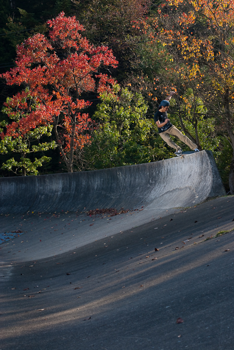
So I will jump right into it and post a shot of Mitch Faber I got a while back that I have had the comments from friends and family that say I love it and great shot wow thats amazing. But as good as those comments feel… they wont make me any money. So let me know if you feel this could be mag worthy, if you would purchase it or what you think should have been done differently. Or if you want to what I used and did to achieve this just ask.

Good thread Darb. It’d be better if you could see the previous post somehow when critiquing a shot (or just open a 2nd tab in firefox).
- #1 complaint with this shot is that it is massively photoshopped. The dude is glowing. This is unnatural and you’ll never see something like this in Transworld
- the trick is hmmm. I’m not that up to date with skate tricks but is this a manual? if the wheels were on the edge then it’s be an ok 5-0. Even if it’s a legit trick there’s not much showing that it’s not a posed shot.
- lurker (the filmer). get lurkers out of the shots. I know it’s harder with a filmer but either find a new angle or make him move. Your darks are blown so you can’t even see the camera.
-composition-wise - show the end corner of the box. It’s (nearly) always essential to give a sense of scale to the trick. Show where he’s going. It’s not too bad in this shot as you can tell the box is ending. An extreme example is a guy-in-the-sky shot.
Sorry if this crit is harsh but that’s how I learnt, and like you said, “sick photo dude” doesn’t make you improve.
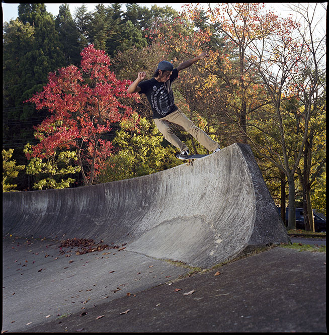
alright here’s one that I’d like to know what to improve. My only idea is to have had a rim flash behind him to separate him a bit from the leaves. Also get him to wear different coloured clothes. This guy’s wardrobe seems to consist of black tshirts and brown pants!
I think I need to rescan the hassy version as the colours look like ass
digital:

the Hassy version

darb does is have to be skating/boarding pics or anything?
darb does is have to be skating/boarding pics or anything?
I vote that we stick to the categories at the top of this site -> snow skate surf girls
Ya was thinking to keep it on par with the website. If you have something that is something we all can appreciate (BMX, mountain biking, base jumping) then use your discretion but, family portraits and things just wont get the attention you may be looking for. If you do have something that you feel you realllllllly want critqued or feedback on PM me and/or some of the other peeps that have been giving good feedback on the site and ask if they mind taking a look.
Cheers
Perfect mate, I was really hoping this shot would bring out some true feedback.
Good thread Darb. It’d be better if you could see the previous post somehow when critiquing a shot (or just open a 2nd tab in firefox).
- #1 complaint with this shot is that it is massively photoshopped. The dude is glowing. This is unnatural and you’ll never see something like this in Transworld
- the trick is hmmm. I’m not that up to date with skate tricks but is this a manual? if the wheels were on the edge then it’s be an ok 5-0. Even if it’s a legit trick there’s not much showing that it’s not a posed shot
- lurker (the filmer). get lurkers out of the shots. I know it’s harder with a filmer but either find a new angle or make him move. Your darks are blown so you can’t even see the camera.
-composition-wise - show the end corner of the box. It’s (nearly) always essential to give a sense of scale to the trick. Show where he’s going. It’s not too bad in this shot as you can tell the box is ending. An extreme example is a guy-in-the-sky shot.Sorry if this crit is harsh but that’s how I learnt, and like you said, “sick photo dude” doesn’t make you improve.
1- I did massive photoshop it as I wrecked the exposure while changing setting and positioning. I decided to go more wallpaper look with this as it was not top quality so I had a good play
2- 100% unposed shot, but do agree, I have a hard time remebering all the names something I am working on.
3- I think Lubomir just got a new nickname lol, but great feedback, will work on that in future shoots with filmers.
4- I usually try to give the athlete a place to go in the shot. Helps heaps to tell a full story and not give that posed look.
I really appreciate the honesty, this is one of those photos that at first has some coolness and recieves alot of the “wow thats great” but true feedback means I can make it better and be better in the futer. Thanks for the honesty
Gamblor
So if you want the photos up while you are looking them over click Quote on the post with the photos and then click preview post. This show the photos on the top and you can add your post and response. Make sure if you dont want the photos to repost delete the quoted section
The joys of take shots of skaters, I think I may start carrying around an extra tshirt cause you know they will alway wear black.
Your totaly right with the flash, you can see some harsh shadow on his face in the Hassy version. A off camera flash behind the wall shooting up on him may have helped to.
The angle and positioning in the Hassy version is more appealing to me, I think in the first shot if you moved the camera a little to the right and had the skater in front of the smaller green tree it may help to get him to stand out a little more as long as can see the whole trick and understand what is happening.
Your digital shot the orange tree in the background looks like it is a little oversaturated (Im also at work right now and my monitor is crap so this could be just on my end.)
Look forward to seeing more!
Darb,
great point about getting the action in the digi shot in front of the green tree. I think that would have made a huge difference.
In the Hassy shot he has his hand up which is causing the shadow on his face from the flash positioned camera left. but with film you can’t tell until you get the film back from the lab.
Brad, great idea for a thread! I’ve j started shooting with a Canon 40D and it’s obvious I have a lot to learn. Here is one of my better photos taken with the new camera. I know I didn’t get the lighting correct, and my timing was probably a little off. Any feedback is appreciated.

Mitch Faber at Cammeray Skatepark
Brad, great idea for a thread! I’ve j started shooting with a Canon 40D and it’s obvious I have a lot to learn. Here is one of my better photos taken with the new camera. I know I didn’t get the lighting correct, and my timing was probably a little off. Any feedback is appreciated.
Mitch Faber at Cammeray Skatepark
I think you’ve got the timing on point. Fill flash would have been a plus. Also, show the landing. one step to the right would eliminate that light(?) coming into the frame. More importantly, that step to the right would get the skater away from being run through by that pole in the background.
Def reshoot this and do it at sunset to give your sky some sick colours. Even if you don’t have a flash, you might be able to get away with the pop up flash (but shooting vertical will mess it up - but it might work). Put a tissue in front to the flash to diffuse it
c’mon guys, lets get some more photos in here.
Gambor, thanks for your feedback. I think you are spot-on with your comments. To be honest I didn’t even think about using the flash. The timing was pointed out by the skater; I think he wanted me to get him right in the middle of the rail, but I do like the position he is in. Unfortunately I didn’t really have a selection of lenses. I shot the photo with a Canon 50mm 1.8 which doesn’t give me much angle to work with. There was a barrier there on the right, so I couldn’t get to the right and stay low. But you are 100% correct. I should have been more to the right.
Guys, please keep it friendly. Feedback is just an opinion, don’t take to too personally. The point of this thread is to help each other out. Cheers.
Suck it up and show that barrier who is boss, haha. I think Gamblor hit it spot on, Shot is a good shot that with a few little changes would be a great shot. Keep shooting and keep learning and have a blast while doing it.
As for the feedback and critiqueing play nice dont bash for the sake of bashing and use any constructive / negative feedback to learn from… It is someones oppinion and thats what this thread is all about
Like the op shot brad.
Its good to hear everyone’s thoughts, I’m a stupendously lazy photographer in the field. So as long as the fov in in the ball park and there isn’t too many highlights I’ll move on. I think it’s because I tried to learn what the hell aperture was with snowboarders whizzing past me.
The mountain of mistakes I made gets corrected on the computer.
So to each their own.
How does cropping the rail on the left side of the photo look? Was distracting for me with my short attention span. Or is it there to balance the photo?