Xcam & SNOcam ~websites~
I didn’t disregard all the great feedback received in my previous thread.
Thanks to everyone that gave input - it was totally helpful in getting me through the decision making process and it put me in contact with Chucky who designed the new logo! ![]()
Anyway;
I threw together this snowy countdown as a page holder today http://www.snocam.com.au
And here is (the so close to complete) http://www.xcam.com.au
If you notice any links not working or spelling mistakes ![]() I would be stoked if you post them here.
I would be stoked if you post them here.

Looking good mate. I’ll have a good browse through on the weekend.
looking good mate
The background hurts my eyes… but the content is good.
Personally I would go with a plain colour or something similar to boardworld where they have large scale images in the back.
Looking good, mate! I’ll have a more in depth look and detailed read through tomorrow.
Yeah, I’m not a great fan of the Background either!!!!! Looks like a kitchenware website kinda????
I do like the X Cam Logo now that It has the “cam” in the center!!!!! To be brutally honest, when I first saw it as ya avatar I wasn’t a fan!!!!!
(I know that ya have chosen it all already, and that my opinion is worth as much/little as the next!!!! So charge on as intended dude!!!!!) ![]()
The logo in my avatar is a basis to built from. It shouldn’t change to much but for adding extra elements to it like cam in the center.
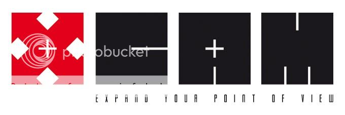
Chucky came it with it after realising all online videos have one thing in common - the expand button - so that is the inspiration for it’s design and it’s inline with what I do. The most important thing is that it’s original, simple, recognisable and easy/cheap to reproduce.
It may not be my favorite of the logos I played with but it certainly matches the criteria of what a commercial logo should be.
Getting there. This is much more like it. Clean, simple, unique, memorable - logo creation rules to live by.
Getting there. This is much more like it. Clean, simple, unique, memorable - logo creation rules to live by.
I really like this!
Is that “Alien” font - I do like it.
Getting there. This is much more like it. Clean, simple, unique, memorable - logo creation rules to live by.
I really like this!
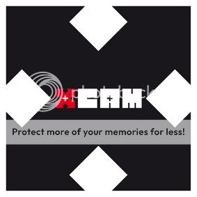
I like this too but feel like it could be defined a little more so it look like the letters a little more. Keep the “X” the same but the “CAM” part is a little hard to read unless you know what your looking for.
I like this too but feel like it could be defined a little more so it look like the letters a little more. Keep the “X” the same but the “CAM” part is a little hard to read unless you know what your looking for.
Nah. People often make the mistake of thinking logos need to be really obvious - but a unique and strong visual identity is much more important. A certain amount of ambiguity’s a good thing when it comes to logos - enabling each individual to interpret them in their own way. But as far as the ‘CAM’ goes, it’s perfectly obvious what each letter is - so there’s no need to be totally in your face. Times have changed, and consumers are a lot more sophisticated than they used to be.
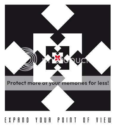
The idea behind the uniformly square shaped letters, is that they can be utilised in various ways that incorporate and enhance the main logo.
For instance - what to do when you want a sticker for a ski pole?
![]()
Is that “Alien” font - I do like it.
The font is ‘Gotham Nights’ Seb.