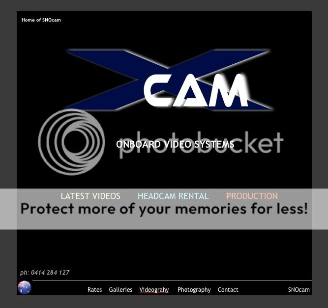
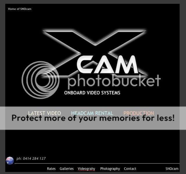
Xcam.com.au - need feedback
^^ I like the second one. Very clean and good style. Looks really good IMO.
First one is OK but the second one is more stylised - looks professional.
I’m not necessarily talking about the logo, just the sizing and positioning of everything. I’m yet to develop a strong opinion on the logo, but I’ll get back to you soon.
The first one (Gamblor’s suggestion) I’ve put 10 min work into.
The second has had days, if not weeks of developing and fine tuning.
I definitely prefer the font and colouring of the logo on the above image, however I prefer the the size and position of the X in the original logo. It just seems a bit much with the huge X, almost as if it’s not part of the name.
I’d like to see a variation with the logo as I described and the ‘ONBOARD VIDEO SYSTEMS’ moved up and right (similar to the position in post #32). I think it’s important to have it there with the logo. It kind of seems out of place where it is now. You want your brand name to be associated with ONBOARD VIDEO SYSTEMS, so put them together.
Just an idea…
Agree with the last point entirely rider, OnBoardVideoSystems is also a link so I tried it separate from Xcam.
Just curious - why did you take out the original banner? I liked it.
Could you have a small version of it up there, and then a link with the other links?
I’ll give it go later, just putting some time into it before a house full of sore tummies wakes up.
The original banner was all one image so I need to rebuild it. It was dropped for a quick loading front page but is still the main header on all pages. I want to give it some more work after Gamblor pointed out a similarity to a light sabre so want to work some mopre of that suggestiveness into it.


