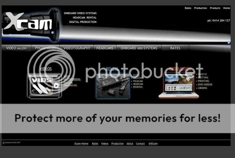
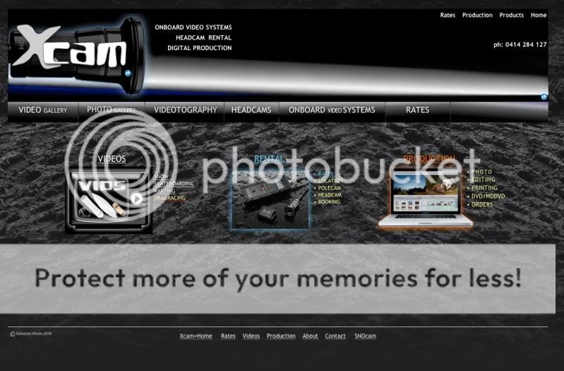
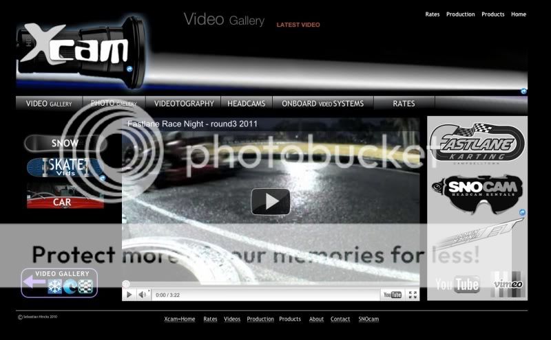
Xcam.com.au - need feedback
every thing seems pretty good to me, but im gona agree with rider, there are a bit of bad spelling in there, im not sure i like the fact the background is just black, its a bit boring sorry ![]()
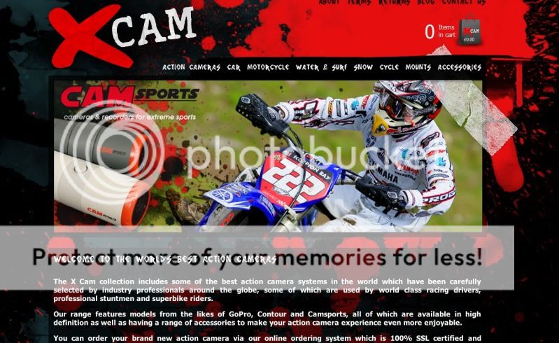
Is this the sort of thing you were thinking amakat - a bit more colour splashed about?
yer something like them, just to make it seem more interesting,
but yer other than that its pretty cool
Don’t apologise!!
I thank you.
I like these spaz!!!!! (But that is my opinion, and it’d be good to get everyone else’s!!!!!)
Maybe a separation of the Colours around the Menu Graphics???? Have the Blue and Orange separated!!!! Even swap the orange out for a colour, say like Lavender???? Seriously but!!!!!
If the Phone # stays, then maybe a different font/colour or written in uppercase to make it a stand out feature of ya service????
Maybe a Hyperlink image of a phone and email that stands out and links ya straight to the selection????
I’ll keep firin stuff, and if ya feel like tryin it or not, I’m still more than happy to keep them comin if ya wish!!!!!
I think I like your version more actually Spaz…looks a bit more professional….leave the mobile on there to id say, nothing worse then having to stuff around finding contact details etc…
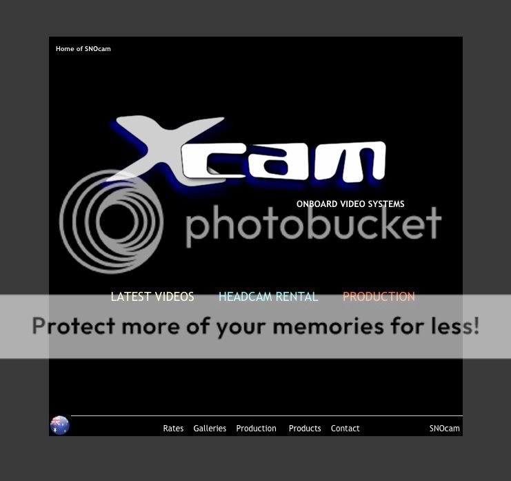
I downscaled a front (intro) page.
Very simple with quick opening time even on dial up speed. Might be something I just keep for a mobile site.
Go to the working version here http://www.xcam.snocam.com.au
I think you should use a more ‘serious’ font for ‘xcam’.
To me, the camera world is high tech and something futuristic & cleaner would be more professional. I mean, you’re dealing with cutting edge pov cam technology, right?
My first thought upon seeing your logo was, ‘is that a light saber? - cool!’
I like the ethnocentric font:
http://www.dafont.com/theme.php?cat=303&text=xcam
The font right now looks like it’s from a cartoon or that Bad Boy brand

but that’s just my 2 cents
B&W Sponos look sweet!!!!
i never saw it as a lightsaber, that is very cool. I may try to make it even more suggestive (but not to much).
There is a a growing swing to change the logo and I’m meeting with a Boardworld voyer (Hi Chucky) on Wednesday. I had settled on what I had but there have been enough convincing reasons (Gamblor’s is an excellent one I 99% agree with) to consider something different. Just in time as I am ordering business cards this week.
The logo will become a sticker that’s on the rental gear also.
With the POV cam it will be close to identical as the web page image.
I disagree spaz!!!!
I quite like the look of the Xcam Logo as it adds a little “Fun” into the mix!!!!! And after all, what ya market is, is exactly that!!!!! Filmin “Fun”!!!!!
I think that it suits well with the Professional surroundings, that ya have included, to let it all have both a serious and a fun feel about The Company!!!!!
The Bad Boy logo is the perfect example of why it possibly could be the right choice, as Logo Design, along with all trends, will do a 360 and eventually make a come back!!!!
Have ya taken different versions of ya logo to the “Public”???? Aim for ya target customer (You should already know this group as ya have dealt with them regularly enough!!!!) Ask them to pick their favourite, out of 3 of your favourite versions of the Xcam logo!!!!! This will undoubtedly get a result that can make the decision easier, and could very well turn out to be the one that ya have chosen already!!!!!
That’s what I’m doing here Mizu. ![]() re: a select group of the “public”.
re: a select group of the “public”.
I had a bit of an internalised debate about the “Bad Boy” look and even though I don’t really like that font it really was a successful branding. That’s what it’s about isn’t it? Making it successful is more important.
I like your comment about fun.
This is great guys - you are all offering opinions from both sides of “the coin” along with excellent reasoning. Keep it up!!!
