Chimp Clothing Feedback!
Yo yo!
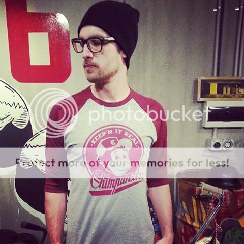
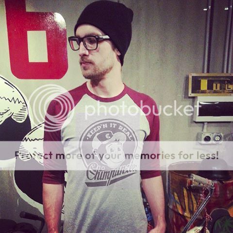
We need your help. What do you reckon of this raglan? We can’t decide what to do with the print. Leave as is, or maybe 2 colours? Your feedback is super important to us. We want to make clothes that you want to ride in, chill in, whatever.

Also, there’s 20% off site wide at the moment! Jump on to Chimp Clothing.
Your feedback is always appreciated!
Thanks guys ![]()
Kris.
Hmm I don’t mind it as it is..
But I need to see some other options… I can’t visualise anything different to whats been posted.
Good call!!!
I think single colour look good, but as oz said need to see the other option ![]()
my feedback:
chimp/chimpanzee is a terrible name.
my suggestion if you want to keep that name: spend a lot of dough and sponsor some big name pros. Then anything is possible
Personally, I’m really digging the name. Ch!mp… it’s sick.
I agree though, you’ve got to be good at what you’re doing to have a brand name like that, because it does grab your attention, but I honestly think these guys are going to kill it.
Back on topic, I like the one colour, but a very small accent of blue could be really cool as well. Might work, might not. Need to see it. ![]()
I like my raglan tops to be just the two colours. The sleeve/logo and the body. Simple is better.
Though would have to see an example of another colour added to 100% decide
After looking at Kopers edit, I think less colour could work.
Maybe have the middle hollow (instead of a big red fill) and have Red everything else the same with a pin black ouline of everything
Yeah fully!! We were thinking about maybe printing the screen but just doing one pass, so it’s not as solid.
And in terms of tees, do you guys like plain tees these days or prints/logos? Understandably, it depends on the type of print, but chatting to our mates in the industry who run shops, they’re finding that people are opting for just a plain tee these days.
Thoughts?
To me its more about quality.
Trents Buse tee are great and don’t look cheap.
Some tees can look like the have come from the bargain bin and i am beyond that look as an adult.
Not everyone may agree with me but thats my view.
Yeah fully!! We were thinking about maybe printing the screen but just doing one pass, so it’s not as solid.
And in terms of tees, do you guys like plain tees these days or prints/logos? Understandably, it depends on the type of print, but chatting to our mates in the industry who run shops, they’re finding that people are opting for just a plain tee these days.
Thoughts?
I like a plain tee with a small logo on it. If it is a medium logo. I just want one. So either in middle front or middle back
I’m colour blind - don’t know what your talking about.
I prefer print’s but it depends on the content - it becomes a challenge to find something personal.
Plain T’s sell more because they are suitable to a broader customer.
Don’t forget T-shirts originated as underwear, as a extra layer for warmth. Think of; white T and blue denim jeans.
Maybe people are buying T’s not for fashion.
I notice many guys these days opt for a collar/button shirt for fashion with a T underneath.
There’s definitely both types of buyers out there. I witnessed it first-hand during my years in retail.
You have the majority of the market (in our industry), who have strong brand allegiances. They know which brands they like, and supporting that brand is more important than fashion. Generalising, you could say this group is younger in age.
Then you have the other guys. They have been around these brands for many years and they no longer have super strong brand allegiances. That’s not to say they won’t buy from brands they like, but they do look for less “in your face” type styles of clothing, especially t-shirts and hoodies etc. They look for simple designs with small logos, or none at all. Some brands are catching on and putting plain t-shirts on the market, even the bigger brands. To these guys, fashion and not sporting huge logos and prints on their t-shirts is more important than having a flashy t-shirt design with huge branding.
I think it’s important to cater to both types of people. After all, they are all consumers who are interested in or participate in boardsports. They just have different tastes and priorities. Try to understand both groups of people. Some cross over as well, sometimes they want simple, sometimes they are happy to wear a louder design. You understand what I’m getting at…
Make loud gear and put it on sponsored riders. Produce simpler gear for consumers - those that want louder stuff can chose from the sponsored gear, market the louder stuff as “limited run” ![]()
In my opinion, when a new brand launches in the marketplace, it’s important to grab people’s attention and stand out from the crowd. What sets you aside from other brands needs to be made clear. Your brand’s personal style, attitude, image and message needs to stand out. Only then will people really know what your brand is all about. Keeping it too simple at the start and not catering to the majority (who look for new and interesting brands), will hurt growth in the long run.
What I’m saying is: be exactly who you guys are. Let your style, attitude and unique message shine through. I’ve met you guys in person and I think you have an amazing story to share with your potential customers and followers. Be exactly who you are and don’t tone it down.
That’s my opinion anyway.
