FYVE + Boardworld Graphic Design Contest 2012
Fixed ![]()
<img src =“http://i49.tinypic.com/2elrvbq.jpg” width =“800”>
Some insane entrys so far!!Here is my first one, I started of with a drawing and then I created textures etc in photoshop to completely avoid any form of copyright.
This is cool. I think Id like the bottom sheet forest green so the antlers stick out more….still cool though!

Sion Gruffydd
http://www.siondesigns.com.au
Welcome to Boardworld, Sion.
Fixed the image for you. ![]()
Facebook album updated.
Fixed
Thanks man!
<img src =“http://i49.tinypic.com/2elrvbq.jpg” width =“800”>
Some insane entrys so far!!Here is my first one, I started of with a drawing and then I created textures etc in photoshop to completely avoid any form of copyright.
This is cool. I think Id like the bottom sheet forest green so the antlers stick out more….still cool though!
Yea i might have a mess around thanks for the feedback

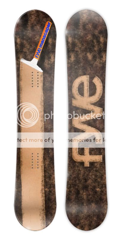
The Manscaper. Trim it down, it will make it look bigger!
![]()
there is something kinda wrong about the manscaper but at the same time it is really well done and funny! Good work trent ![]()

FYVE - Lets Go Skatin’
Design by Warwick Ralston
MIND = BLOWN ![]()
Does it really matter how many likes are on the designs on the facebook page? Like in judging aspects?
:p
MMMM Boobs
